Why felt is different
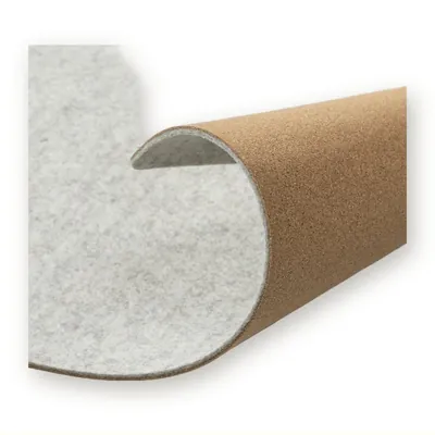
Needle-punched felt has no smooth face. Ink sits on loose fibres, and fine lines and small text break up. The thicker and fluffier the felt, the bolder the logo has to be.
The main methods
| Method | Works best for | Watch out for |
|---|---|---|
| Screen print | Large, bold logos in one or two colours | Lines thinner than about 1 mm, gradients |
| Embroidery | Small logos with character | Many colours raise the price; dense stitching can pucker thin felt |
| Patch (leather-look, PU, recycled) | Premium look on totes and sleeves | Adds another material to the bag |
| Woven label | Discreet branding, retail private label | Small visible area |
| Deboss / heat press | Tone-on-tone, calm look | Needs denser felt |
Practical rules
- Send a vector logo and ask for a mock-up on the real felt colour.
- Use light ink on dark felt sparingly: coverage can look uneven.
- For bags that will be washed, ask about the ink and test a sample.
- Keep text larger than you would on paper.
Minimums
Most methods start from about 100 pieces per model. A patch or label is often the easiest way to brand small runs. See logo and private label and the felt bag range.